18 Suminagashi Tattoo Ideas That Blend Art and Ink Seamlessly
Drop ink into still water and it doesn’t sit there. It spreads, curls, folds back on itself, then stops moving the second paper touches the surface. That’s suminagashi, and putting it on skin means asking a tattoo to hold a shape that was never supposed to stay still.
Standard tattoo linework tells your skin what to do. Suminagashi does the opposite. There’s no repeating pattern, no symmetry to fall back on, no bold outline holding everything together for you. Every swirl has to read as intentional even though the whole point of the source material is that nobody controls exactly where ink goes once it hits water.
Here’s the part nobody tells you before you book the appointment: done wrong, this style looks like you walked into a door. Soft grey gradients with no anchor point read as a bruise from six feet away, not art. The pieces that actually work lean on sharp black contrast and real negative space, not just a wash of grey trying to look mysterious.
The 18 ideas below aren’t just reference photos to screenshot. Each one comes with where it actually sits well on a body, what it demands from an artist, and the one thing most people don’t think about until the swelling goes down. Let’s get into it.

18 Suminagashi Tattoo Ideas
1. Spine Anatomy Flow
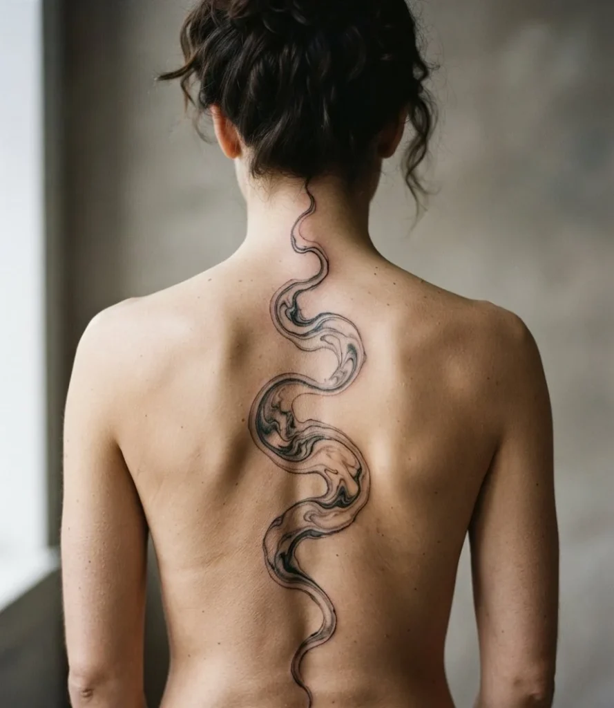
Aesthetic Vibe & Elements: A single continuous ribbon of black ink follows the spine’s natural S-curve, thinning and thickening the way real ink does when it drags across a surface. No repeating motif, just one unbroken line finding its own path.
Ideal Body Placement: The spine already has a built-in curve suminagashi wants to follow. Nothing about this design fights the body’s own architecture.
Practical Tip: A design this long sitting directly over the spine means multiple sessions, and the bone proximity makes it one of the more painful placements on this list.
2. Rib Cage Drift
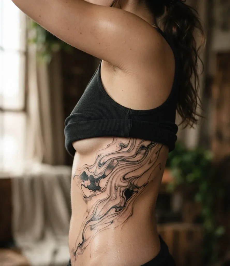
Aesthetic Vibe & Elements: Ink pools and drifts between the rib lines, using the body’s own gaps as breathing room instead of fighting them. Dense in some pockets, almost see-through in others.
Ideal Body Placement: Ribs give the design built-in negative space for free, since the body itself creates the breaks the ink needs to look intentional.
Practical Tip: This is one of the more painful spots on the body, full stop. Plan for a genuinely uncomfortable session no matter how delicate the design looks on paper.
3. Forearm Current
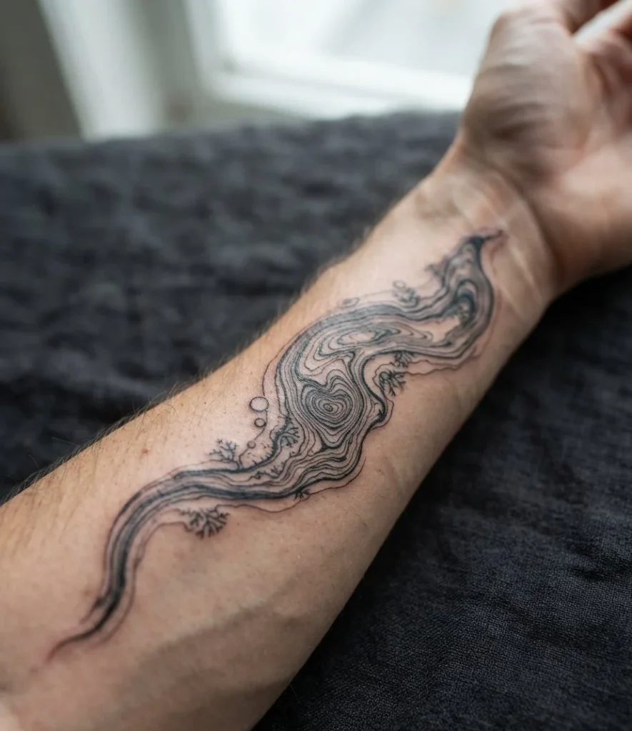
Aesthetic Vibe & Elements: A tighter, more controlled channel of ink runs down the inner forearm, like water forced through a narrow gap rather than spreading freely.
Ideal Body Placement: The forearm’s flat, elongated shape gives a single current room to run its full length without getting cut short by a joint.
Practical Tip: Inner forearm skin is thinner and more sensitive than the outer arm, so expect more discomfort than a typical forearm piece.
4. Indigo Drift
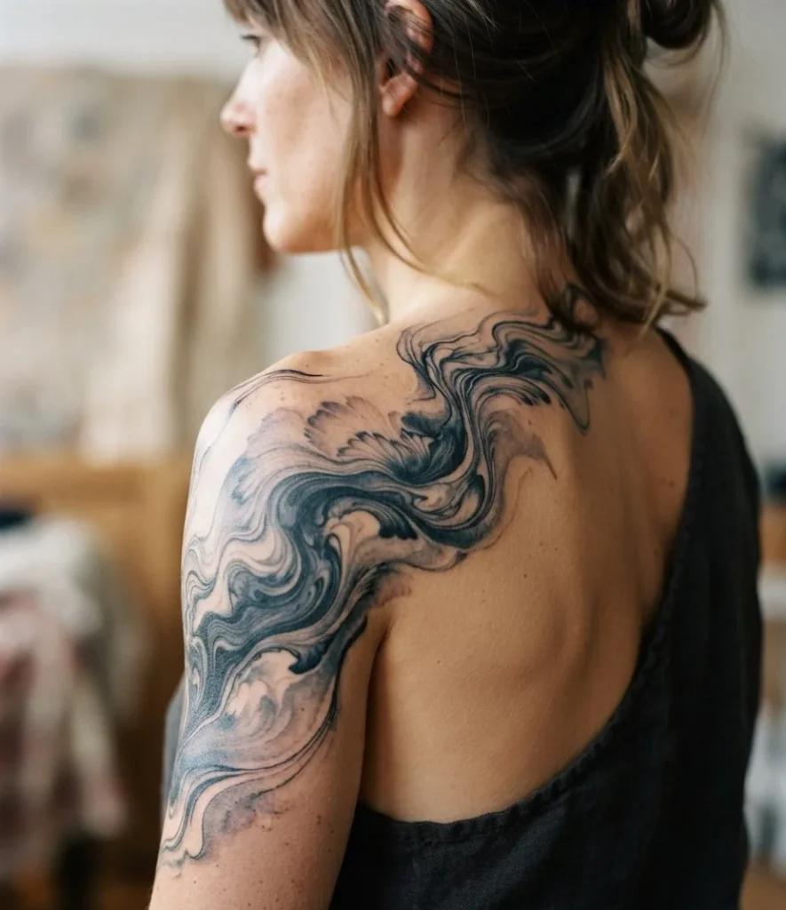
Aesthetic Vibe & Elements: Instead of straight black, this leans into deep indigo and near-black blue, the tone real sumi ink takes on when it’s diluted just slightly.
Ideal Body Placement: Works anywhere with enough flat surface for the color transitions to actually show. Upper arm and shoulder blade both handle it well.
Practical Tip: Blue-black ink can fade warmer and greyer than pure black over time, so set realistic long-term color expectations before you commit.
5. Geometric Negative-Space Slice
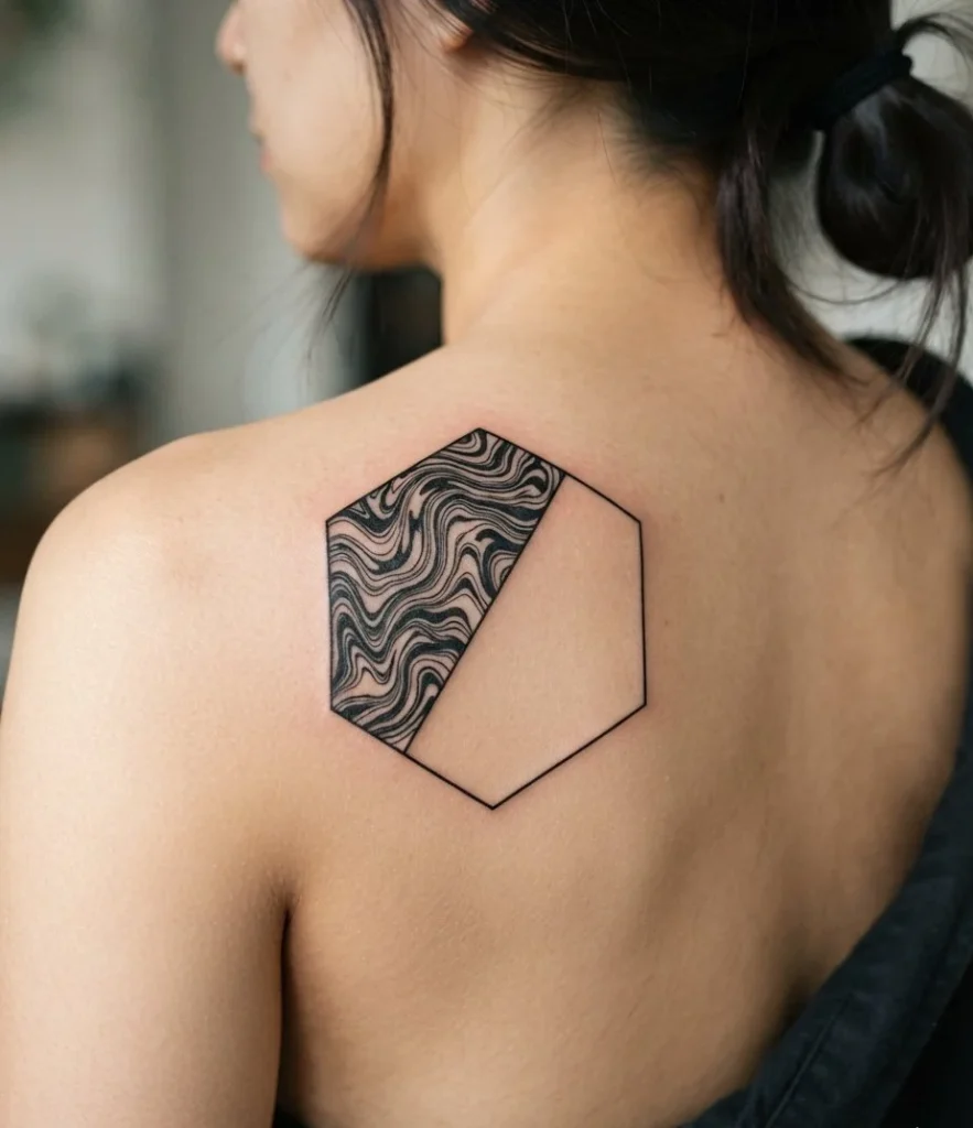
Aesthetic Vibe & Elements: A hard-edged triangle or hexagon cuts directly through the organic swirl, leaving half the shape completely bare skin. The contrast between fluid and rigid does the heavy lifting.
Ideal Body Placement: Flatter areas like the shoulder or upper back let the geometric shape stay perfectly crisp instead of warping around curves.
Practical Tip: This design lives or dies on how clean that straight edge stays, which means you need an artist genuinely confident in both styles, not just one.
6. Full Sleeve Tide
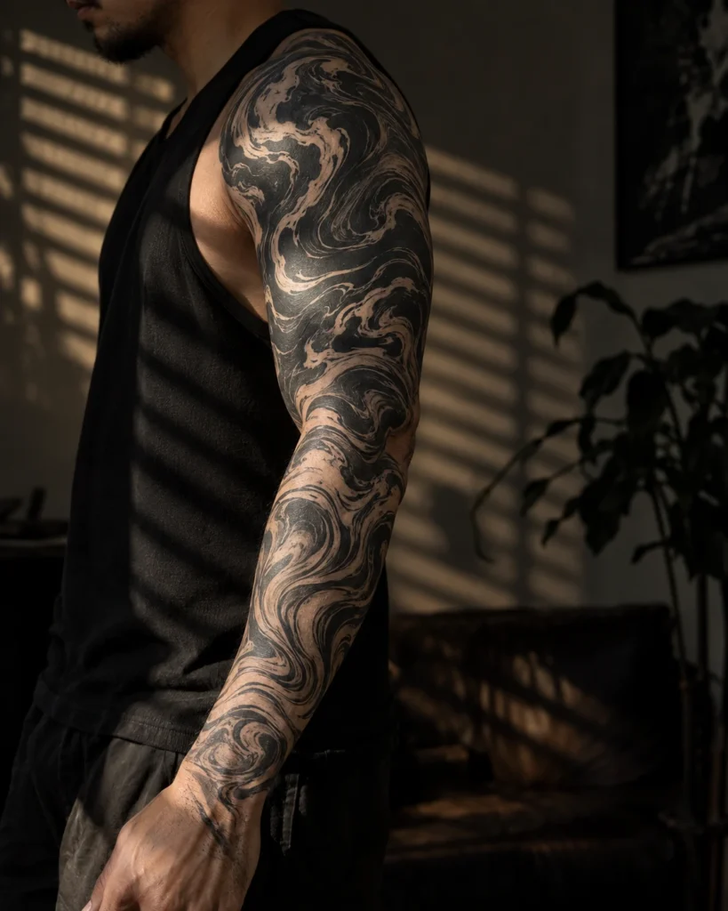
Aesthetic Vibe & Elements: The pattern doesn’t repeat down the arm, it evolves, denser and tighter near the shoulder, looser and more open by the wrist, like a tide actually pulling back.
Ideal Body Placement: A sleeve gives suminagashi the length it needs to actually show movement instead of sitting as one static swirl.
Practical Tip: This is a multi-session commitment. Budget real time and real money, not a single afternoon appointment.
7. Shoulder Cap Pool
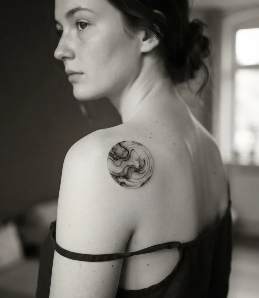
Aesthetic Vibe & Elements: Ink gathers and pools right at the curve of the shoulder, contained rather than spreading, like it settled into a shallow basin and stopped moving.
Ideal Body Placement: The shoulder’s rounded shape gives the pooling effect somewhere logical to collect.
Practical Tip: Keep this one contained. Don’t let the design creep too far down the arm, the pooled effect only reads clearly at a smaller scale.
8. Collarbone Trace
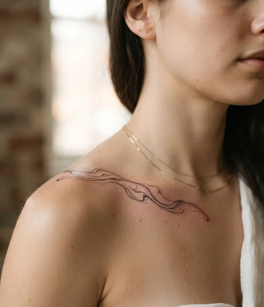
Aesthetic Vibe & Elements: A thin, restrained line of marbling traces just above the collarbone, minimal enough that it reads as delicate jewelry rather than a full piece.
Ideal Body Placement: The collarbone’s straight-ish line gives a thin trace something clean to follow without needing much width.
Practical Tip: Thin lines this close to bone fade faster than bolder work. Expect a touch-up sooner than you would on a fleshier placement.
9. Moon-Caught Ripple
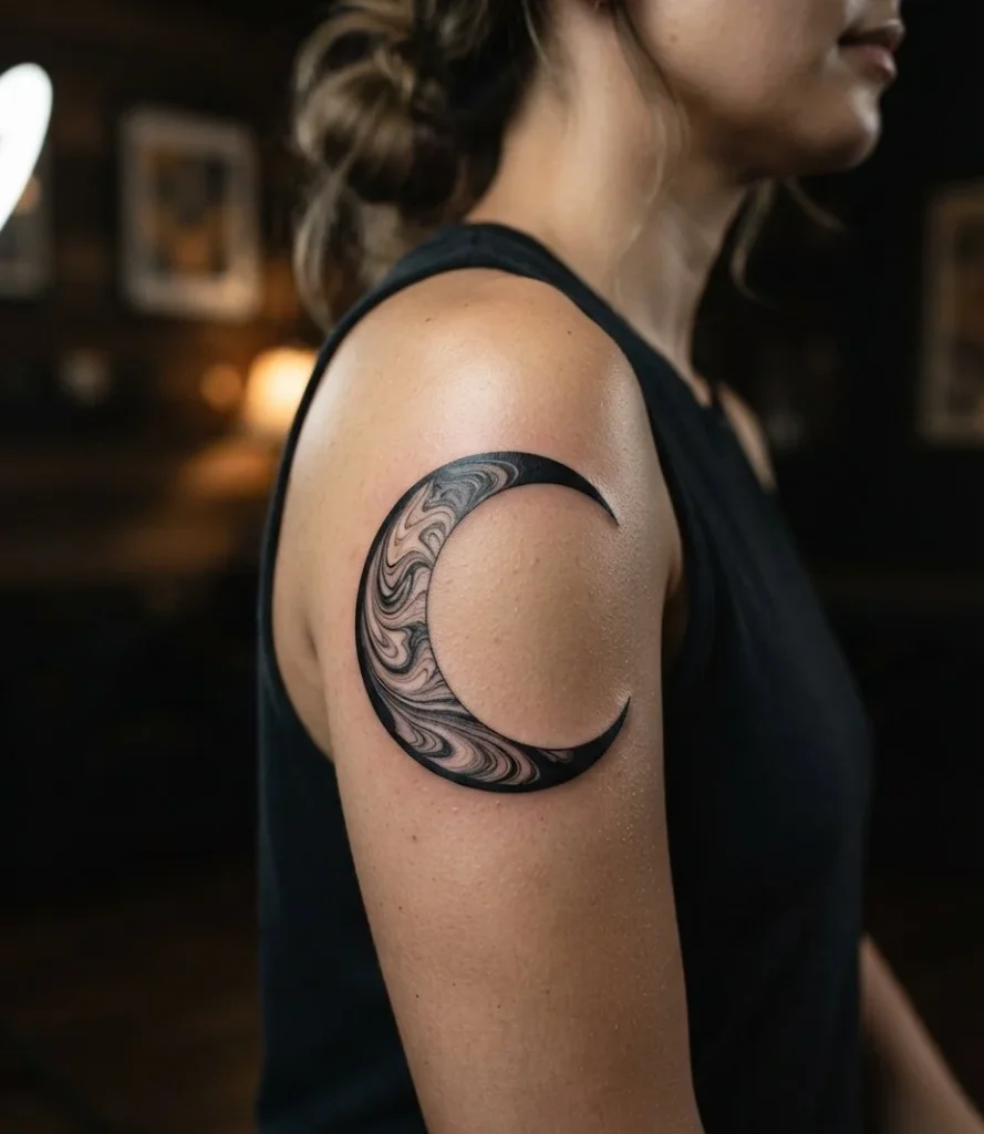
Aesthetic Vibe & Elements: A crescent or full moon gets filled entirely with marbled swirl texture instead of flat shading, so the moon itself looks like it’s made of moving water.
Ideal Body Placement: Shoulder or upper arm gives the moon shape enough flat space to keep its outline clean while the texture does its thing inside.
Practical Tip: The moon’s outline needs to stay sharp even as the inner texture softens with age, or the whole shape blurs into its own background.
10. Koi in the Current
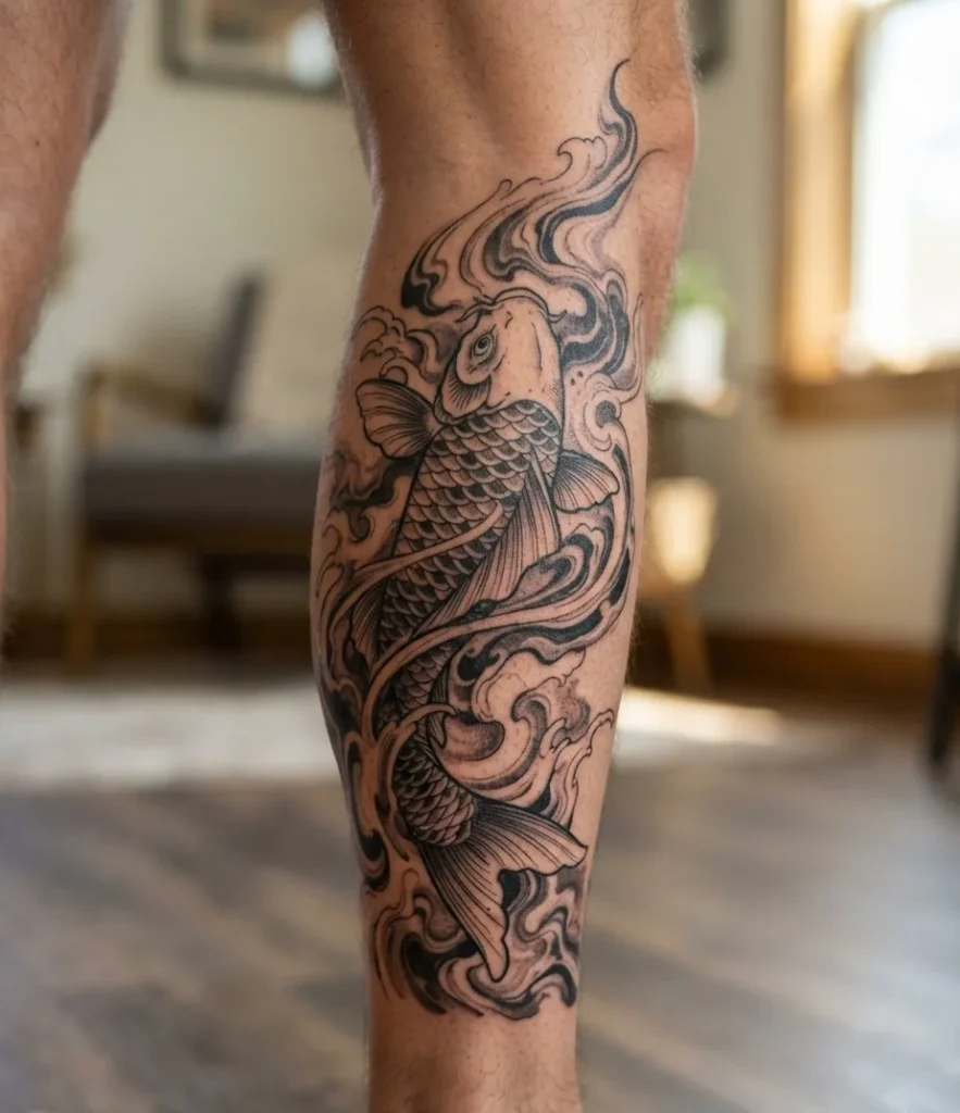
Aesthetic Vibe & Elements: A single koi swims through the marbled background rather than sitting on top of it, its body partially dissolving into the same swirl texture surrounding it. Our Japanese dragon tattoo ideas cover another classic water-based Japanese motif if a dragon fits your story better than a koi.
Ideal Body Placement: Calf or thigh gives both the fish’s body and the surrounding current room to actually breathe.
Practical Tip: Keep the koi’s outline slightly bolder than the background swirl, or it disappears entirely once the piece heals and softens.
11. Cherry Blossom Bleed
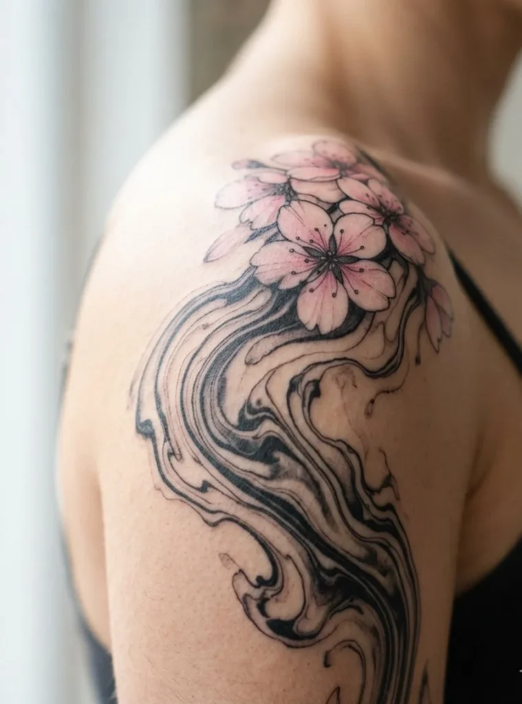
Aesthetic Vibe & Elements: A few sakura petals appear to be dissolving directly into the ink, half solid, half already absorbed into the surrounding swirl.
Ideal Body Placement: Shoulder or ribcage gives the scattered petals room to drift naturally without crowding the marbling.
Practical Tip: Pink pigment fades faster than black, so the “dissolving” effect actually intensifies on its own over the years, which works in this design’s favor for once.
12. Wave Break Hybrid
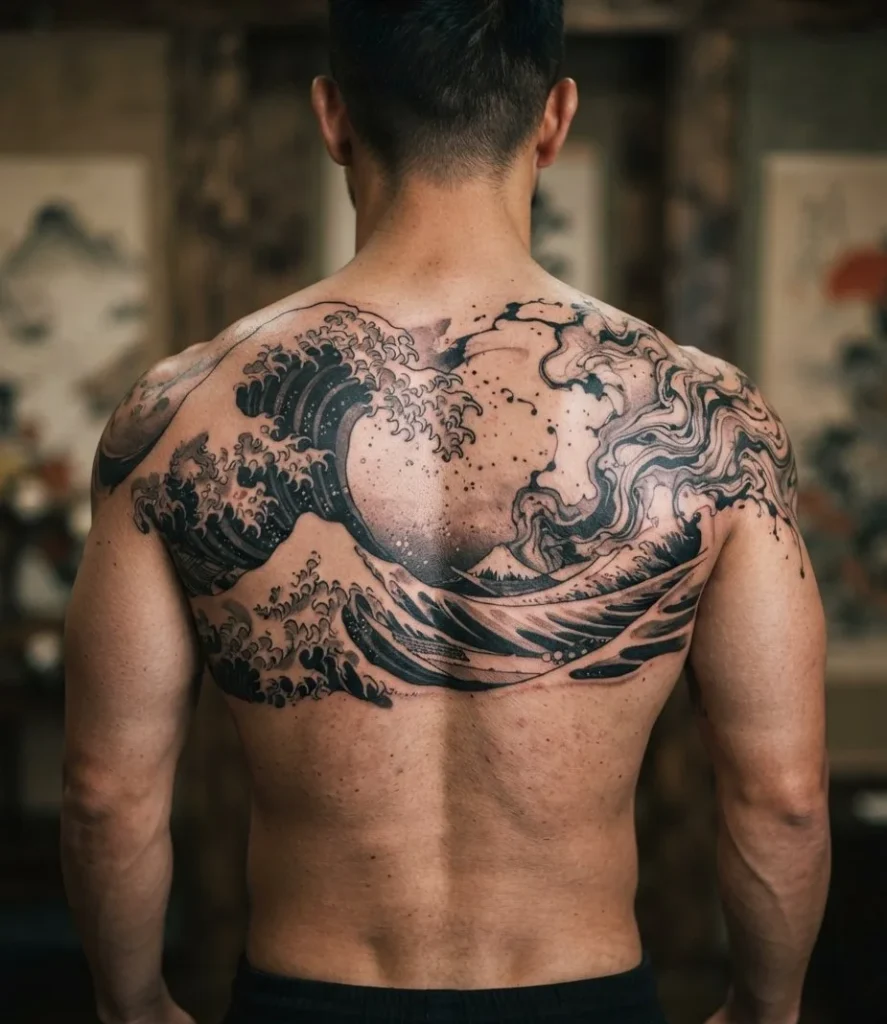
Aesthetic Vibe & Elements: Classic Japanese wave crests, the sharp, structured kind, merge directly into loose marbled texture at their edges, like a wave already starting to lose its shape. Our torii gate tattoo ideas cover more traditional Japanese elements if you want to build this into a larger themed piece.
Ideal Body Placement: Back or full sleeve gives both the structured crests and the looser marbling room to build real scale.
Practical Tip: This hybrid needs an artist genuinely trained in traditional Japanese wave work, not just someone who’s good at freehand swirls.
13. Ankle Eddy
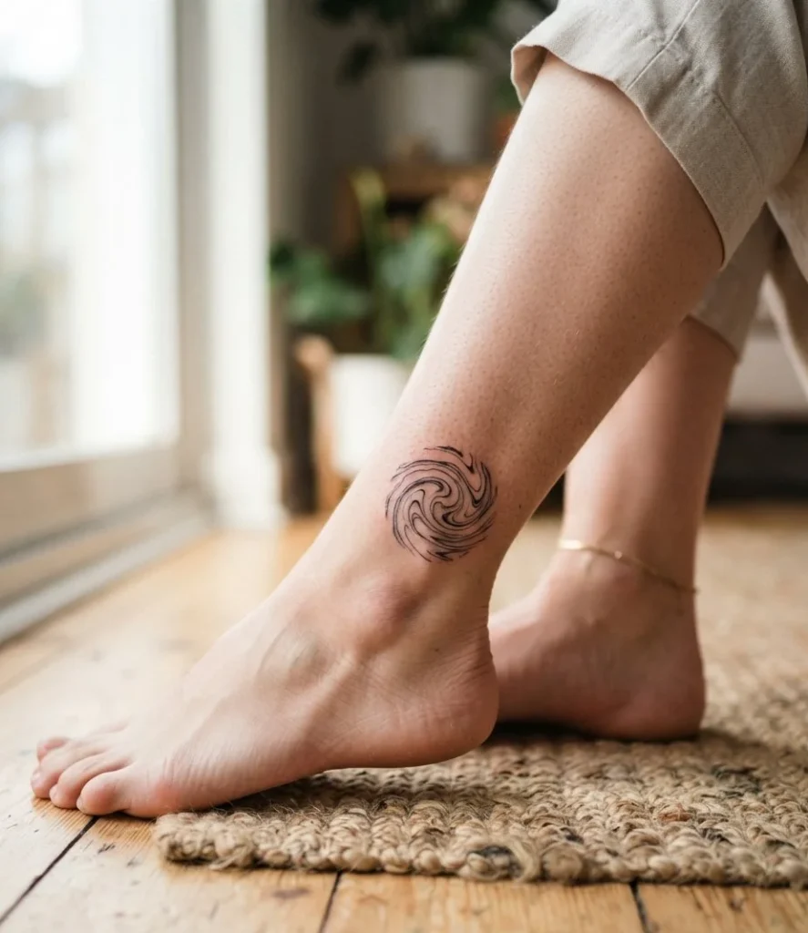
Aesthetic Vibe & Elements: A small, contained swirl sits right at the ankle bone, tight and compact, like a tide pool rather than open water.
Ideal Body Placement: The ankle’s small, bony surface keeps the design naturally contained without needing much restraint from the artist.
Practical Tip: Ankle skin takes real abuse from socks and shoes. Expect this one to need a touch-up sooner than most placements on this list.
14. Behind-the-Knee Pocket
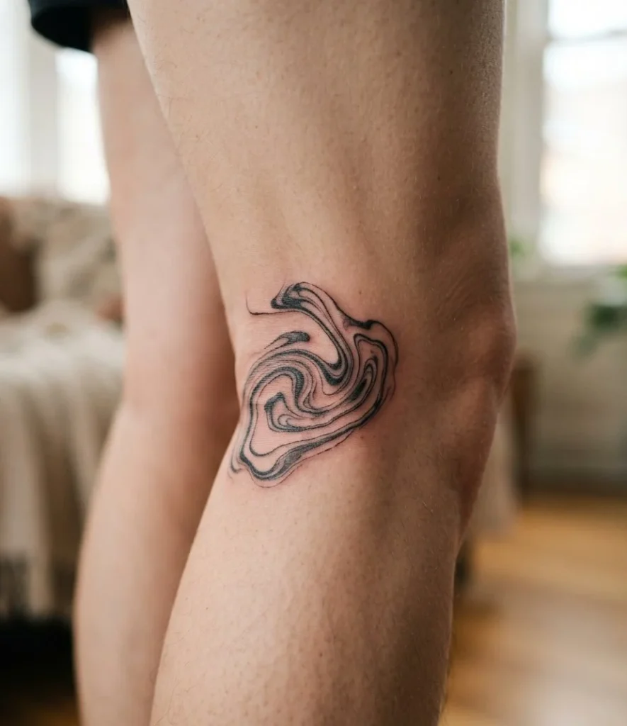
Aesthetic Vibe & Elements: A tiny marbled detail hides in the crease behind the knee, barely visible unless the leg is bent, more personal secret than statement piece.
Ideal Body Placement: The knee crease is one of the few spots on the body that’s genuinely hidden by default, only showing when you want it to.
Practical Tip: Surprisingly painful for how small the design usually is. Thin skin and constant movement don’t make for an easy session.
15. Back Panorama
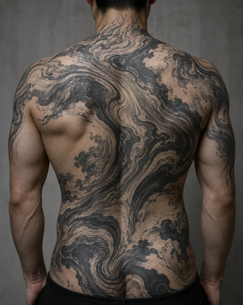
Aesthetic Vibe & Elements: The entire back becomes one continuous marbled surface, no repeated motif, just one unbroken movement from shoulder to hip.
Ideal Body Placement: Nothing else on the body offers this much flat, uninterrupted space for the pattern to develop real scale.
Practical Tip: A serious, multi-session commitment in time and cost. Don’t walk into the consult expecting a quick timeline.
16. Thigh Wrap Current
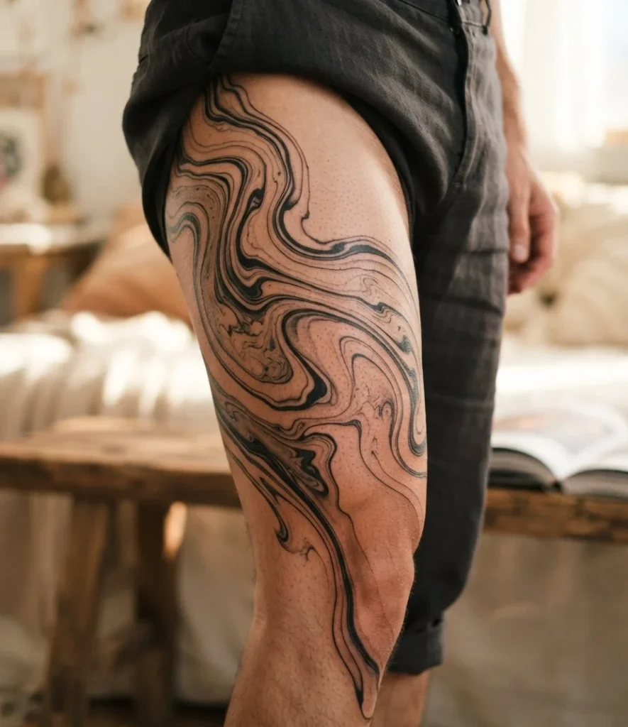
Aesthetic Vibe & Elements: Ink flows around the natural curve of the thigh muscle rather than sitting flat, following the body’s actual shape instead of a flat sketch.
Ideal Body Placement: The thigh’s rounded muscle gives the current something real to wrap around, exactly what separates this style from a flat stencil job.
Practical Tip: This only works if your artist actually maps the design on your skin in person. A flat drawing pulled from a screen won’t wrap correctly.
17. Monochrome Fade Gradient
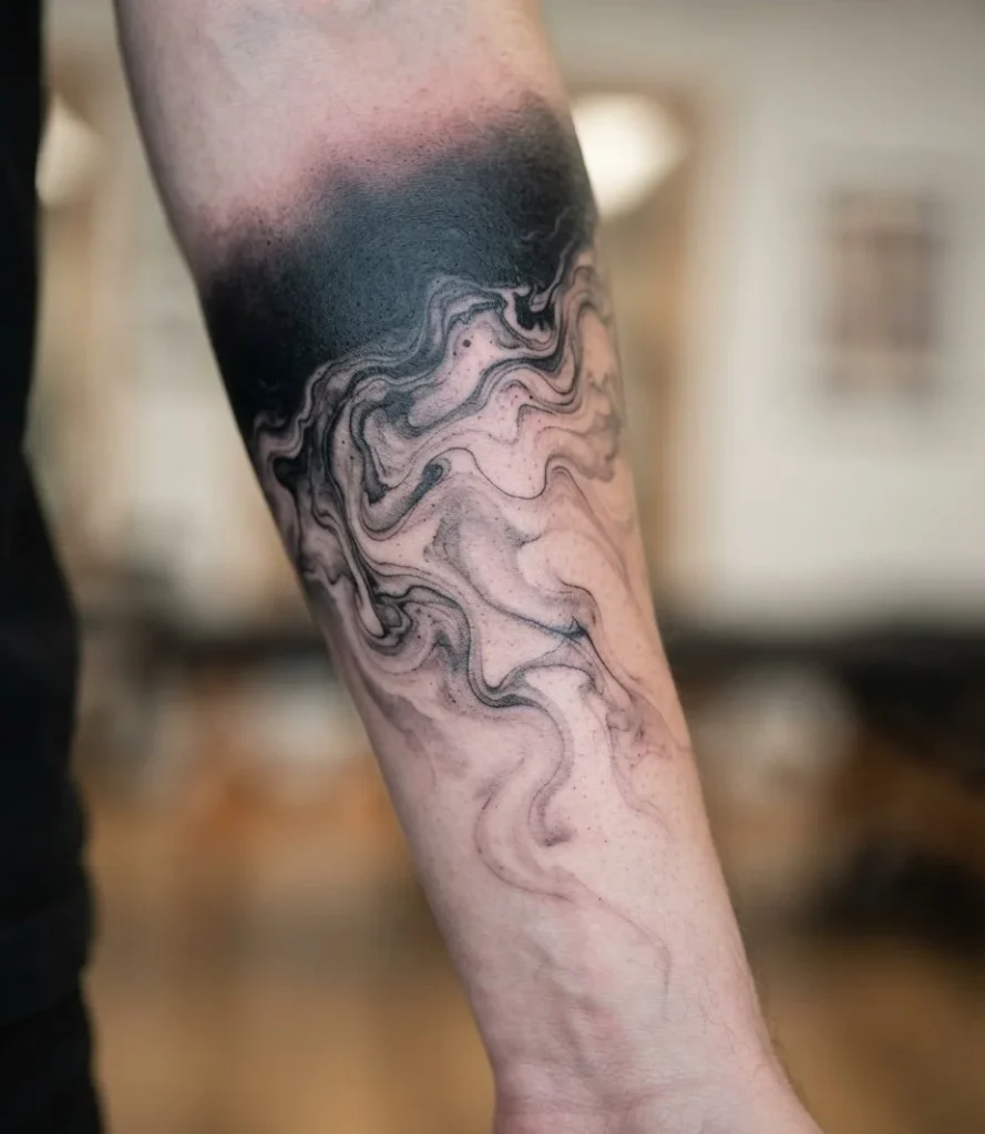
Aesthetic Vibe & Elements: Pure black fades into soft grey with zero hard outlines anywhere in the piece, relying entirely on shading control rather than any linework at all.
Ideal Body Placement: Flatter, larger areas like the upper back or outer thigh give the gradient room to transition smoothly without a joint interrupting it.
Practical Tip: The hardest version of this style to execute well, and the easiest to end up looking like a bruise if the artist isn’t genuinely skilled at gradient work specifically.
18. Two-Tone Contrast Strike
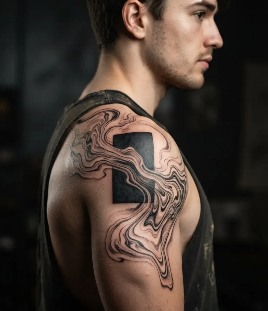
Aesthetic Vibe & Elements: One bold, solid black geometric shape anchors the piece while loose marbled texture drifts around it, giving the eye somewhere solid to land.
Ideal Body Placement: Upper arm or shoulder blade gives both the solid anchor shape and the looser texture room to stay visually separate.
Practical Tip: That solid black anchor is doing more work than it looks like. It’s the single biggest factor in whether this piece still reads clearly ten years from now.
The Aging Reality: How Suminagashi Heals Over Time
Fresh suminagashi looks incredible on day one. Sharp black, crisp grey transitions, exactly like the reference photo. That’s not the version you’re actually committing to.
Ink doesn’t stay exactly where the needle puts it. Macrophages, the immune cells that carry pigment away as part of the body’s normal response, pull small amounts of it deeper into the skin over years, not weeks. On bold linework this barely registers, the line was thick enough to begin with. On soft, feathered grey-wash suminagashi with no hard edges, that slow spread is the difference between a piece that still reads as intentional at year eight and one that’s turned into a soft grey smudge.
This is exactly why the designs on this list that hold up longest share one thing: real black anchor points and real bare skin. A gradient with nothing solid to hold onto has nowhere to go but softer and vaguer. A gradient anchored by even one genuinely saturated black shape, or one clean stretch of untouched skin, gives the eye something to lock onto even after the softest greys have spread into each other.
Healed suminagashi also just reads differently than the fresh version, and not only because of spread. Skin itself settles ink a shade or two softer and greyer than the day you walked out of the studio. Ask to see healed reference photos at your consult, not just fresh ones, so you actually know what you’re signing up for five years out.
How to Brief Your Artist
You cannot hand an artist a flat printed stencil and expect suminagashi to work. That’s the first thing to understand going in.
Stencils are built for designs that don’t care about the body’s actual shape underneath them, a rose is a rose whether it’s on flat paper or a curved shoulder. Suminagashi is the opposite. The whole point is that the pattern responds to the surface it moves across, which means it needs to be drawn directly onto your skin, usually freehand with a marker, before a single needle touches you.
Ask specifically how your artist plans the flow around your own muscle and bone structure. A good answer sounds like “I’ll draw it on you and we’ll adjust together in the chair.” A bad answer sounds like “I’ll email you a design first.”
Then check healed work, not just fresh photos. Any artist can make suminagashi look sharp on day one, fresh ink is forgiving. What you actually want to see is how their pieces look at the one-year mark and beyond, since that’s the real test of whether they understood contrast and negative space well enough for the piece to survive its own aging process.
Quick Placement & Pain/Longevity Matrix
| Placement | Pain Level | Flow Compatibility | Longevity |
|---|---|---|---|
| Spine | High | Excellent, natural curve to follow | Good, with strong black anchors |
| Ribs | Very High | Excellent, built-in negative space | Good |
| Inner Forearm | Moderate to High | Good, flat and elongated | Very Good |
| Shoulder / Shoulder Blade | Moderate | Excellent, rounded pooling surface | Very Good |
| Thigh | Moderate | Excellent, wraps with muscle curve | Excellent |
| Ankle | Moderate to High | Good, small contained scale only | Fair, high friction area |
One last thing before you book: this style rewards patience in the chair more than almost any other. If your artist is rushing the freehand mapping to save time, that’s the moment to slow down, not speed up. The whole piece is riding on that part being right.