
16 Iconic Sukuna Hand Tattoo Ideas: Designs, Symbolism, Pain Scale & Reality Check
Sukuna’s hands are hard to forget. The black bands, the stripes, the sharp geometry that looks less like decoration and more like a brand burned into the body. That’s exactly why so many Jujutsu Kaisen fans want to wear it for real.
Here’s the catch. On screen, those bands are flat, clean, and perfectly placed. On a human hand, the skin stretches, folds, and shifts every time you make a fist, so solid black geometry has to be planned around a joint that bends nearly ninety degrees.
Hands and fingers are also the toughest place on the body to heal and keep a tattoo. The skin is thin, it sheds fast, it gets washed constantly, and it’s hit by sun and friction all day. Ink fades, blurs, and sometimes drops out entirely, and most hand tattoos need touch-ups.
So here are 16 Sukuna-inspired hand tattoo ideas, with a straight read on pain, healing, fading, and what each design asks of your artist.
Quick-Decision Matrix
| Design Concept | Ideal Placement | Pain Level | Healing Complexity | Fading / Touch-up Horizon |
|---|---|---|---|---|
| The Minimalist Wrist Cuff (1) | Wrist | 5/10 | Moderate | 2-3 years |
| Knuckle Chevron & Split Finger Bands (2) | Back of the fingers and knuckles | 7/10 | High | 6-12 months |
| Palm-Center Cursed Eye (3) | Center of the palm | 8/10 | High | Weeks to a few months |
| Back-of-Hand Cursed Seal Apex (5) | Back of the hand | 6/10 | Moderate | 1-3 years |
| Heavy Solid Blackout Tapered Cuff (13) | Wrist to forearm | 6/10 | High (heavy scabbing) | 3-5+ years |
Numbers in brackets match the design list below. These are typical ranges, and results depend on your artist, your skin, and how much friction and sun your hands get.
The Anatomy & Lore Behind Sukuna’s Markings
The markings pull from two places. The first is real history: during the Edo period in Japan, criminals were sometimes marked with tattooed bands and symbols on the arm or forehead as punishment, a visible record of what they’d done. Fans and commentators often connect that to Sukuna’s bands, though that link is a reading of the design rather than something the creator has spelled out. Our Japanese dragon tattoo ideas cover how traditional Japanese tattoo style grew out of that same history.
The second is pure fiction. Gege Akutami’s cursed world gives Sukuna a distinct visual language of bands, stripes, and extra eyes that only exists in the series. Many of the designs below, especially the palm eye and the sigil fusions, are fan interpretations of that language rather than exact panels.
How the Bands Move with Your Hand
Hand position changes how a band looks. With your palm facing down (pronated), the two forearm bones cross, and with your palm facing up (supinated) they sit parallel, so a band wrapped around the wrist shifts and can look slightly crooked from one position to the other.
The fix is to stencil in the position your hand rests in most of the time, usually relaxed at your side. Finger stripes and knuckle chevrons have the same problem, which is why every stencil should be checked flat and in a fist.
16 Sukuna Hand Tattoo Ideas
1. The Minimalist Yuji-Sukuna Wrist Cuff
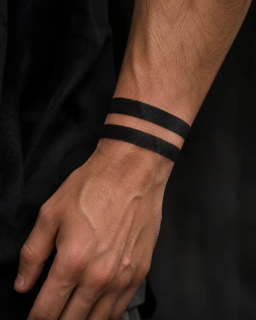
Classic
Visual Description: Two clean black bands wrapped around the wrist, the most recognizable Sukuna mark and the easiest one to wear. It reads as a cuff or bracelet from across the room and doesn’t need explanation.
Placement & Flow: Sits just above the wrist bones, with the bands running parallel to the wrist’s natural taper. The wrist is narrower on the thumb side, so the bands should tilt very slightly to look straight.
Tattoo Artist Tip: Have the stencil placed with your hand relaxed at your side, not held up in the air. Ask for bands thick enough to hold a full black fill, and pack the fill with a magnum rather than going over it with a liner.
2. Knuckle Chevron & Split Finger Bands
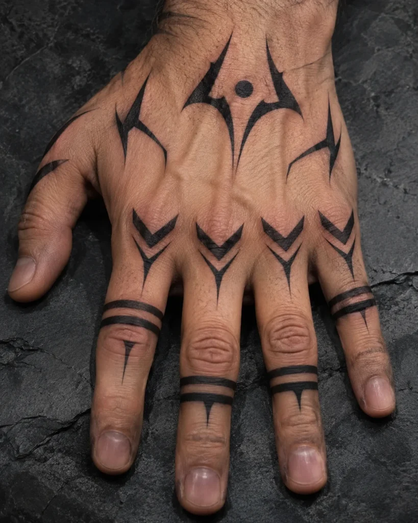
Geometric
Visual Description: V-shaped chevrons pointing across the knuckles, with thin bands splitting down the fingers. It’s the busiest design on the list, and it looks great when the hand is flat and aggressive when you make a fist.
Placement & Flow: Chevron points land on the top of each knuckle, with the bands running along the finger above it. The skin folds hard at the knuckle, so the point of the V can’t sit right in the crease.
Tattoo Artist Tip: Check the stencil in a fist and with the hand flat before any ink goes in. Keep the bands slightly thicker than feels necessary, because thin black lines on knuckles tend to spread and blur.
3. Palm-Center Cursed Eye (Sukuna’s True Form)
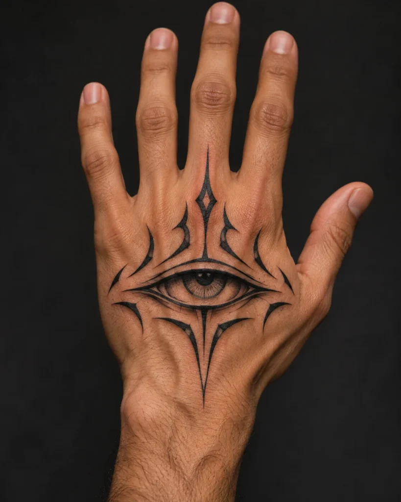
Fan Concept
Visual Description: A single stylized eye in the center of the palm, drawing on the extra eyes of Sukuna’s true form. It looks incredible in a photo with the hand open, and it’s the hardest idea on this list to keep.
Placement & Flow: Dead center of the palm, with the eye shape following the natural palm creases. Palm skin is thick and renews itself fast, so ink here fades faster than almost anywhere on the body.
Tattoo Artist Tip: Many artists refuse palms for exactly this reason, so ask early. If you go ahead, keep the eye large and simple, skip fine detail in the pupil, and plan on two or three touch-ups in the first year.
4. Negative Space “Cleave” Slashed Bands
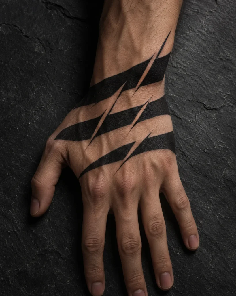
Blackwork
Visual Description: Solid black bands with sharp diagonal gaps cut through them, like something sliced the stripe open. The gaps of bare skin give the design movement, and they look especially good against the tendon lines on the back of the hand.
Placement & Flow: Wrist or the back of the hand, with the slashes angled in the same direction so the bands feel like one cut. The gaps follow the hand’s natural diagonals.
Tattoo Artist Tip: Keep every gap at least 2 millimeters wide. Narrower gaps tend to fill in as the ink settles, and the cleave effect disappears. Stencil with a ruler, because uneven slash angles show instantly.
5. Back-of-Hand Cursed Seal Apex
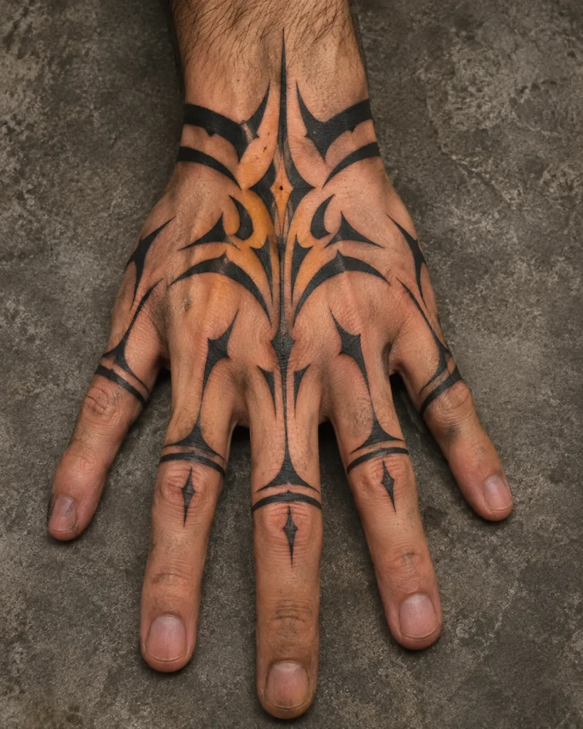
Symmetrical
Visual Description: A pointed, symmetrical seal in the center of the back of the hand, with the apex aimed toward the fingers or the wrist. It’s flat, visible, and the best canvas on the hand for a bold design.
Placement & Flow: Centered on the line of the middle finger, with the seal spreading across the knuckles. The back of the hand has the most stable skin of the whole hand, which helps this design hold its sharp edges.
Tattoo Artist Tip: Mark the center line while your hand is flat and your fingers are slightly spread. Ask for the points to be drawn a touch blunter than the reference image, since razor-thin tips are the first parts to soften.
6. Dual-Wrist Mirroring Crest
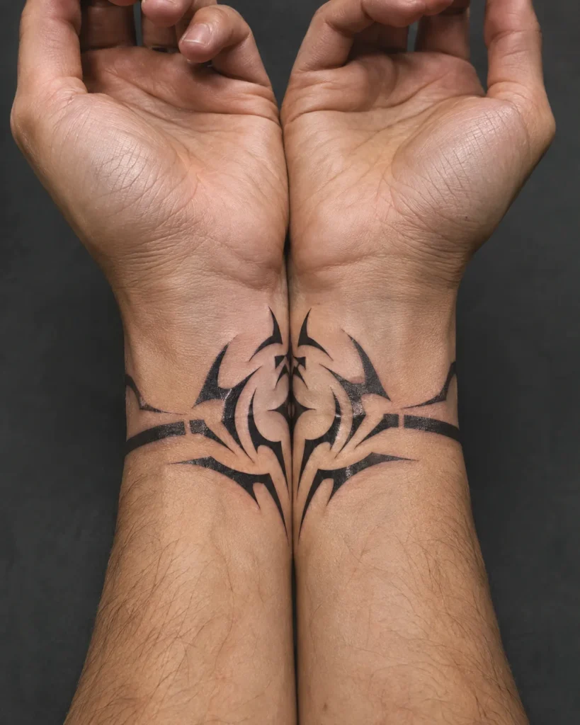
Mirrored
Visual Description: A crest on each wrist that connects when your hands come together, like the two halves of one sigil. It only reads fully when you press your wrists or hands together, which makes it feel like a secret.
Placement & Flow: Inside edge of both wrists, with the crest lining up when the wrists touch. It works best when both pieces are placed in exactly the same spot on each arm.
Tattoo Artist Tip: Get both wrists done in the same session if you can. Ask the artist to mirror the stencil digitally, and place each side with your hands pressed together so the halves actually meet.
7. Crimson Accent & Solid Black Contrast
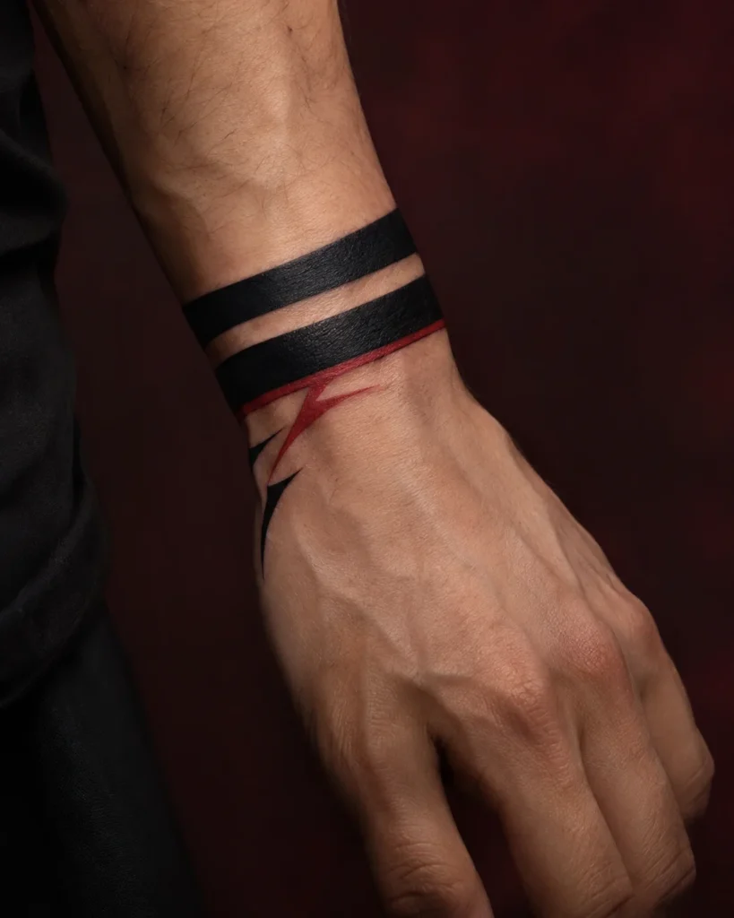
Red Accent
Visual Description: Solid black bands with a thin crimson stripe running alongside, giving the design a cursed, bloody edge. The contrast makes the black look even deeper.
Placement & Flow: Wrist or back of hand, with the red line sitting along the edge of the black band.
Tattoo Artist Tip: Red tends to fade faster than black, so frame the red with black on both sides to hold its shape. Expect the red to need a touch-up before the black does, and to heal a little lighter than it looked fresh.
8. Single Finger Accent (Thumb & Index)
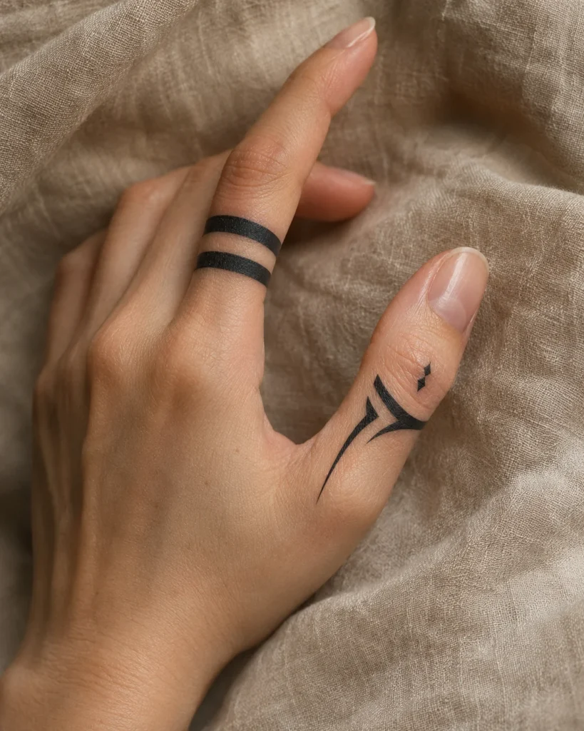
Blackwork
Visual Description: Isolated stripes on just the thumb and index finger, a quiet nod that most people will assume is a design choice rather than a reference. It’s the lowest-commitment way to wear the look.
Placement & Flow: Across the back of the finger, not down the sides. The sides of the fingers are where ink drops out fastest, and our witchy finger tattoos guide goes into what to expect from finger ink.
Tattoo Artist Tip: Use two bold bands instead of three or four thin ones. Thumbs move a lot, so ask the artist to place the stencil with your thumb bent and straight.
9. Modern Cyber-Sigilism Sukuna Fusion
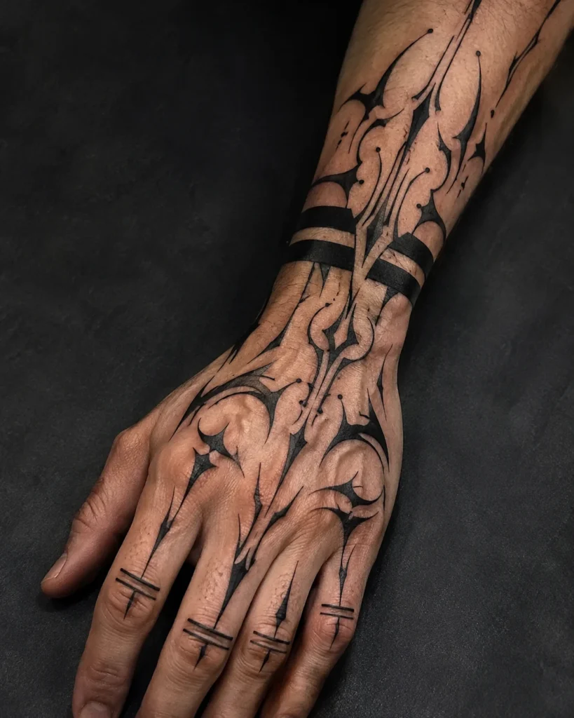
Sharp Line
Visual Description: Sharp, thorn-like sigil lines sweeping out from the traditional bands, mixing the Sukuna look with the spiky, futuristic style of cyber-sigilism. It adds aggression and movement to a simple cuff.
Placement & Flow: Wrist and the back of the hand, with the sigil lines sweeping toward the knuckles and up the forearm.
Tattoo Artist Tip: Thin spiky tips blur first. Ask for bold, tapered lines and keep neighboring lines at least a couple of millimeters apart, or they merge into a single dark patch after a few years.
10. Malevolent Shrine Torii Silhouette Fade into Forearm
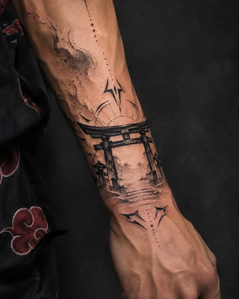
Stipple Fade
Visual Description: A torii gate silhouette on the wrist or back of the hand, its pillars fading into stippled dots as they travel up the forearm. It borrows from the shrine imagery of the series without copying a single panel. Our torii gate tattoo ideas have more ways to draw the gate itself.
Placement & Flow: Starts at the wrist or back of the hand and fades up the forearm over about 8 to 10 centimeters.
Tattoo Artist Tip: Build the fade with stippling instead of smooth shading, since smooth gradients don’t hold well on hands. Keep the torii’s pillars thick and solid, and let the fade happen on the forearm, where skin is calmer.
11. Stipple & Dot-Work “Dismantle” Disintegration Cuff
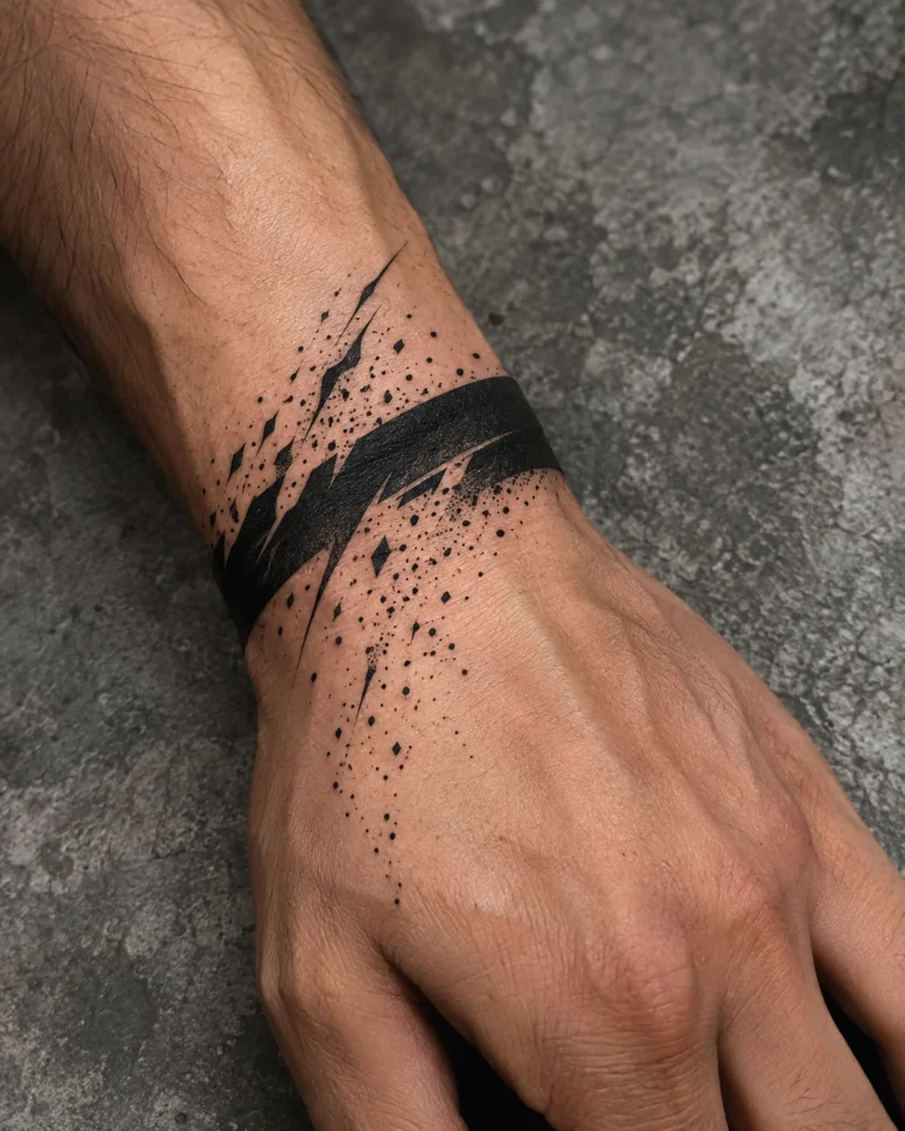
Stipple
Visual Description: A solid band that breaks apart into scattered dots as it moves away from the wrist, like it’s being dismantled in real time. The dots give the cuff a soft, unraveling edge.
Placement & Flow: Wrist, with the disintegration spreading up the forearm or across the back of the hand.
Tattoo Artist Tip: Use larger dots than you would on the upper arm, and space them a little wider. Some dots will drop out unevenly over time, so a looser, scattered layout ages better than a tight pattern.
12. Micro-Detailed Finger Crease Eyes
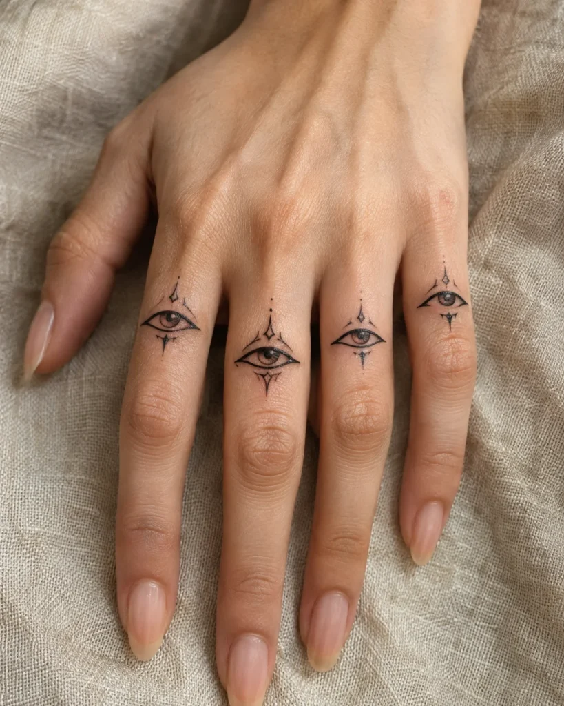
Micro Detail
Visual Description: Tiny eyes tucked into the finger creases, a detailed idea that looks amazing in a close-up photo. It’s also the riskiest concept on this list, since fine detail on finger skin is exactly what hands handle worst.
Placement & Flow: On top of the finger segments, between the creases, not inside them. The creases flex constantly, and ink inside them wears out quickly.
Tattoo Artist Tip: Keep each eye at least 5 to 6 millimeters wide, with a bolder outline than you’d use elsewhere. Even then, plan on yearly touch-ups, and talk to your artist about whether this is the right idea for you.
13. Heavy Solid Blackout Tapered Cuff
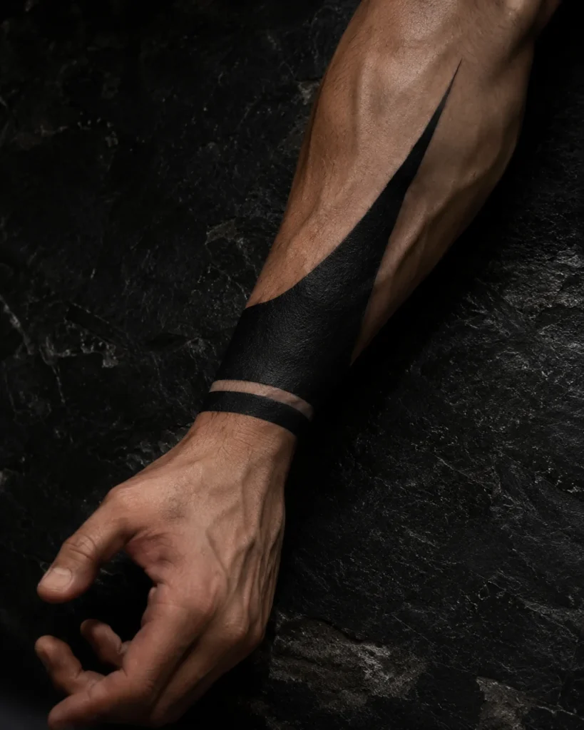
Tapered
Visual Description: A thick black cuff on the wrist that tapers into a point up the forearm. It’s the heaviest, boldest version of the look, and it makes the strongest statement of anything here.
Placement & Flow: Starts at the wrist and tapers up the inside or outside of the forearm, following the muscle lines.
Tattoo Artist Tip: Solid fills this size usually take two passes, with a few weeks of healing in between. Expect heavy scabbing, and don’t pick at it, because picking pulls ink out and leaves patches that need extra touch-ups.
14. Forearm-to-Palm Heel Continuous Ribbon
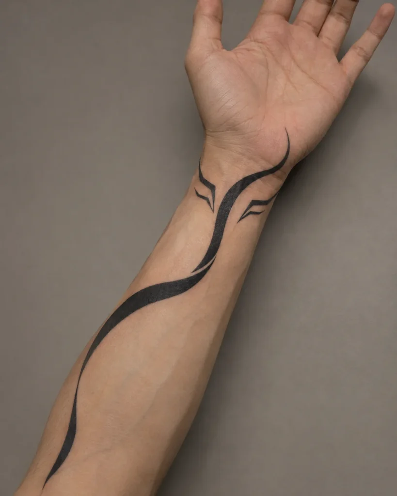
Flowing
Visual Description: A single ribbon of black that starts on the forearm, wraps around the wrist, and ends at the heel of the palm. It connects the whole hand into one continuous line.
Placement & Flow: Inner forearm, across the wrist, and ending at the heel of the palm, with the ribbon following the natural line of the tendons.
Tattoo Artist Tip: The heel of the palm is thick, high-friction skin, and ink there fades quickly. Stencil it with your hand both palm-up and relaxed, and consider ending the ribbon just before the palm so the main line stays on skin that holds ink better.
15. Demon Claws: Black Dipped Fingertips
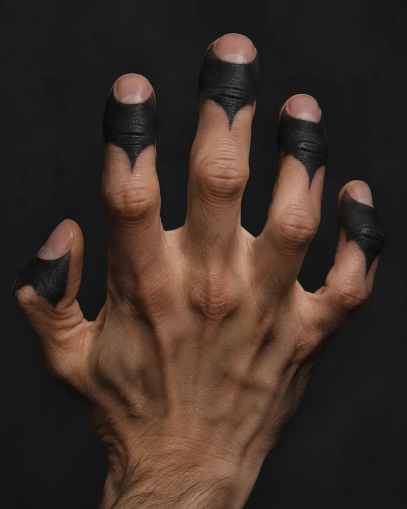
Extreme
Visual Description: Fingertips fully blacked out, as if they were dipped in ink. It’s a dramatic, high-impact look, and also one of the hardest ideas to actually keep.
Placement & Flow: The top of the last finger segment, from the knuckle crease to the tip. Fingertips have almost no stable skin for ink to settle into.
Tattoo Artist Tip: Many artists will refuse fingertip tattoos. If you do find one willing, expect fast fading and a lot of upkeep, and think seriously about stopping the black at the last knuckle instead of right at the tip.
16. Hidden UV / Blacklight Cursed Energy Accent
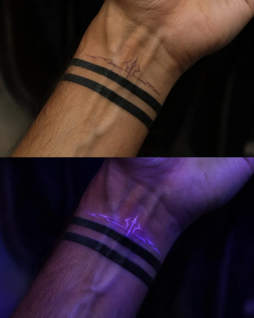
Hidden
Visual Description: A subtle accent in UV ink that only glows under blacklight, tucked next to a regular black band. In normal light it’s almost invisible, and under a blacklight it looks like cursed energy.
Placement & Flow: Inside the wrist or along the edge of a band, where it can sit next to a visible black design.
Tattoo Artist Tip: UV ink is less well-studied than standard pigment, and some people report skin reactions. Ask your artist what pigment they use, request a patch test, and keep the design simple, since UV ink also tends to fade faster than standard ink.
The Realities of Hand & Finger Ink
Pain Breakdown by Zone
- Back of the hand (about 5-6/10): Thin skin over tendons and bone, sharp but usually the most tolerable hand spot.
- Bony knuckles (about 6-7/10): Almost no cushioning, so the needle vibration travels right through the bone.
- Sides of the fingers (about 6-7/10): Thin, sensitive skin, and the most painful part to sit through for many people.
- Inner palm (about 7-8/10): Dense nerve endings and thick skin that doesn’t hold ink well, so you pay in pain and in touch-ups.
Blowout & Ink Drift Risk
A blowout happens when ink goes in too deep and spreads into the surrounding tissue, leaving a bluish blur around the line. Finger sides are the worst for it, since the skin is thin and there’s almost no fat to cushion the needle, and friction between fingers wears the ink down faster than anywhere else.
Even a perfect job can drift over time. Bold, simple shapes with generous gaps age better than fine detail packed tightly together.
The “Job Stopper” Factor
Hand tattoos are visible in almost every setting, and heavy blackwork stands out even more. Many workplaces are relaxed about them now, but conservative fields like finance, law, and some client-facing roles can still be strict, and some uniformed services restrict hand tattoos outright. If you’re unsure, start with a wrist cuff that hides under a watch or a sleeve, check your workplace’s policy first, and consider drawing the design on with a marker for a week to see how it feels.
Artist Briefing & Aftercare Protocol
How to Vet the Right Artist
- Look for blackwork and tribal specialists. Solid, even black fills and crisp edges are a different skill from delicate watercolor or micro-realism.
- Ask for healed hand photos. Fresh photos always look good, and healed work shows how the artist’s tattoos actually age.
- Ask about their process. What needles they use for fills, how they stencil hands, and whether they check the stencil in a fist.
- Walk away from pressure. An artist who doesn’t warn you about fading on hands isn’t being straight with you.
The First 14 Days of Healing
- Follow your artist’s wrap instructions. Take the wrap off when they tell you to, not earlier.
- Wash gently two or three times a day. Use lukewarm water and a fragrance-free soap, rinse fully, and pat dry with a clean paper towel.
- Moisturize thinly. A very thin layer of ointment or unscented lotion is enough, and over-saturating can clog the skin and lift ink.
- Manage friction. Skip rings, watches, and tight gloves on the area, and wear breathable gloves for dirty work instead of leaving it exposed.
- Expect peeling and scabbing. Solid black tends to scab heavily around days four to ten, and picking pulls ink out.
- Protect it from the sun after healing. Once it’s fully healed, wear SPF on the area every day.
Realistic Touch-up Expectations
Most hand tattoos need at least one touch-up, and finger and palm pieces may need several in the first year. Ask your artist before you leave the chair whether touch-ups are included, when to come back, and what they consider normal fading versus a problem. A good artist will tell you the truth about this up front.


